WePari brandbook
A practical guide for using the WePari identity consistently across websites, partner materials, presentations and campaign assets.
Brandbook materials from the old site
Logo samples, cobranding layouts, color blocks, typography boards and patterns for consistent WePari communication across partner materials.














The logo is the primary brand identifier. Keep it isolated from dense UI, third-party marks and promotional text so it remains readable at every size.
Logo system
Use the approved SVG logo in digital interfaces and the print-ready PDF files for offline materials. Minimum digital width should stay above 120px for partner pages and 90px for compact headers.
Do
- Use the original logo file without changing proportions.
- Keep clear space around the mark equal to the height of the W letter.
- Use the white logo on dark or high-contrast brand backgrounds.
- Use only approved brand colors for nearby graphic elements.
Do not
- Do not stretch, rotate, crop or redraw the logo.
- Do not place the logo on noisy imagery without contrast control.
- Do not add outlines, shadows, bevels or extra effects to the mark.
- Do not recolor the logo outside the approved brand palette.
Core palette
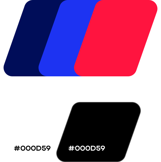
The current site tokens define the brand palette. Use red for priority actions and key emphasis, blue for product depth and partner-platform surfaces, and black for the main stage.
Approved depth fields
Primary action
Use for focused CTA zones and active campaign moments.
Blue product field
Use for partner dashboard, analytics and platform surfaces.
Hero depth
Use for page introductions and brand-first screens.
Type system
The current website uses Actay Wide for high-impact headings and Roboto for body copy, UI labels and forms.
Use for page titles, section headers, numeric highlights and campaign headlines.
Use for readable paragraphs, forms, navigation, captions and operational text.
Brand elements
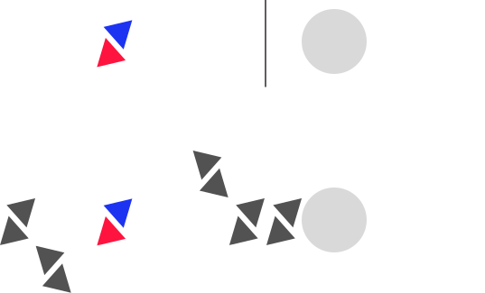
Use graphic shapes as supporting elements, never as replacements for the logo. Campaign compositions should keep enough empty space for CTA and partner copy.



Full brand guide
The PDF guide includes the source logo rules and extended visual examples from the original WePari brand materials.